As Ohio voters head to the polls next week, many will struggle to overcome congressional districts that have allowed politicians to choose their voters instead of the other way around.
Thanks to an aggressive redistricting operation, Ohio’s current congressional map, enacted in December 2011, is gerrymandered to lock in a 12-to-4 district advantage for Republican candidates.
In each subsequent election, it has worked according to plan: In 2012, Republican candidates earned 51 percent of the statewide vote, but secured 75 percent of the state’s congressional seats. In 2014, they earned 59 percent of the vote, but held onto 75 percent of the seats. In 2016, the Ohio GOP took 57 percent of the vote, and — yet again — kept 75 percent of the Congressional seats.
In May, the ACLU challenged Ohio’s gerrymandered map as a violation of voters’ constitutional rights, seeking to replace it with a new one before the 2020 election.
In our lawsuit, APRI v. Smith, we submitted a new proposed congressional map, drawn by our expert, Bill Cooper — who has drawn maps in about 750 jurisdictions across 45 states, primarily on behalf of plaintiffs represented by civil rights organizations.
Our proposed map improves the existing one every way.
Here’s how:
It undoes the extreme “packing” and “cracking”
A side-by-side comparison of the two maps shows stark differences. Whereas Ohio’s current map has multiple irregularly shaped, barely contiguous districts, the new map is more compact and splits fewer counties and cities.
Look at the top right (Districts 7, 9, 11, 13, 16) and the bottom left (Districts 1, 2), for easy points of comparison. Note there is no more “Snake on the Lake,” as District 9 is often labeled, because of how it ingests portions of five counties while containing none in their entirety.
Current Ohio Map:

Proposed Ohio Map:
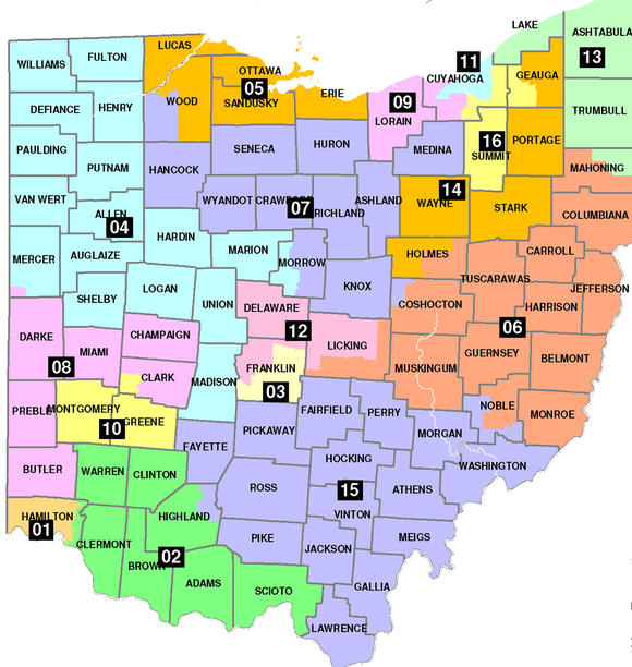
Gerrymandering is primarily achieved by either “packing” — overconcentrating a particular class of voters in a district in order to diminish their efficacy in other districts — or “cracking,” the practice of splitting up a particular class of voters so that they are unable to band together and see their will reflected in their elected representatives.
The differences are most dramatic around Ohio’s cities, where more voters who support Democrats tend to live. Currently, these population centers and surrounding areas are sliced up in various ways, so that pieces of the same city lie within different voting districts, and/or are packed together, so that their reach is limited to a single district.
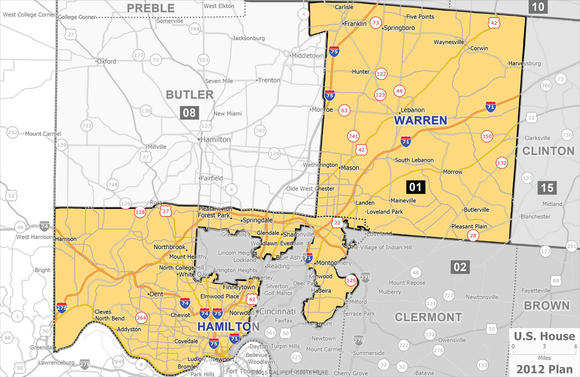
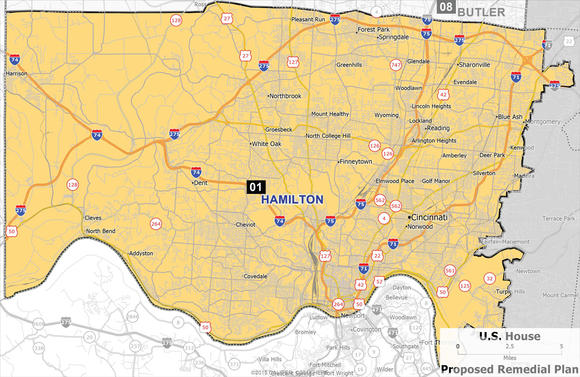
For example, Cincinnati is cracked across Districts 1 and 2 of the current map. Our proposed map would make the city whole.
Current District 1 Map:
New District 1 Map:
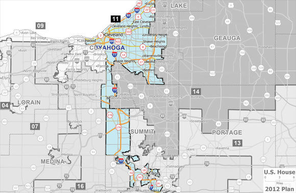
The same is true in Northeast Ohio. Cleveland and Akron are both cracked apart, and then half of each is packed into a single district, District 11.
The remaining portion of Cleveland is then packed into District 9 — the “Snake on the Lake” — with the city of Toledo. And the other half of Akron is packed into a district with the city of Youngstown.
One of our plaintiffs, Chitra Walker, lives in Lakewood, a city that is part of the Cleveland area in District 9. Instead of belonging to the same district as others living in Cleveland, she shares a district with people living in Toledo, which is 108 miles away. This contorted construction ensures that regardless of changes in voter preference across election cycles, Democrats are limited to prevailing in the same four districts each cycle.
Current District 11 Map:
New District 11 Map:
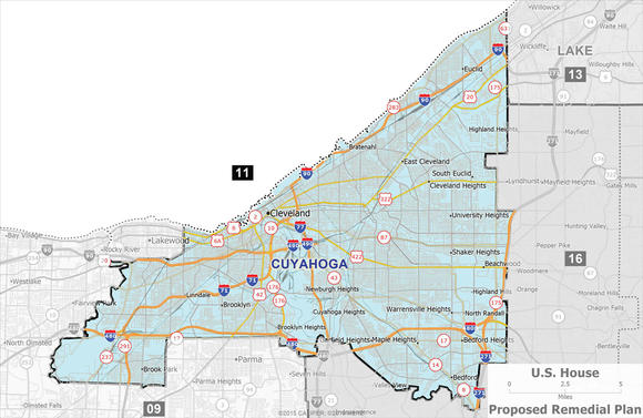
In May, Ohio voters overwhelmingly approved Issue 1, a ballot initiative that seeks to reform how congressional maps are drawn going forward. It puts a limit on the number of cities and counties that can be split and sets out other redistricting criteria, including making districts more compact.
Ohio’s current congressional map splits 23 counties, while our proposed plan splits just 14. The current map splits both Cincinnati and Cleveland, while our proposed plan keeps them whole. And it is not just the big cities: The current map splits 73 cities, towns, and villages, while our proposed map splits only 27.
It better complies with the Voting Rights Act
The map is also better under the Voting Rights Act, which guarantees that minority voters have a chance to have their voices heard and votes counted. In the context of redistricting, it protects minority voters against plans that dilute their voting strength, which is mainly done in two ways. The first is by submerging minority voters in a district where they do not have the opportunity to elect candidates of their choice. The second is by packing, or concentrating, minority voters into one district in order to limit the number of places where these voters can impact elections.
In creating our map, we had one of our experts conduct “racially polarized voting analysis.” This is the analysis used in the context of the Voting Rights Act to determine what minority voting age population is needed to ensure that minority voters have the opportunity to elect their candidates of choice. Setting the minority voting age population below this threshold would demonstrate vote dilution achieved by the first of the two methods described: submerging minority voters. Setting the minority voting age population substantially above this threshold would demonstrate the second: overpacking of minority voters in one district.
Our analysis found that in order for Black voters in northeastern Ohio to have the opportunity to elect their candidates of choice, they needed to make up above 45 percent of the voting age population in District 11.
Currently, Black voters comprise over 52 percent of the voting age population in District 11, where they are overconcentrated. The map drawers never did the necessary analysis before overpacking black voters into District 11.
In our proposed map, District 11 would retain a Black voting age population of about 47 percent. That means it would address the excessive packing of Black voters into District 11, but still ensure that these voters have the opportunity to elect their candidates of choice — thus ensuring the protection of these voters, as required by the Voting Rights Act.
It is responsive to the will of voters
Instead of the consistent 12-4 split, which gives Republicans 75 percent of the seats despite getting just over 50 percent of the vote, the new map allows for electoral results that actually change based on voters’ choices. In fact, it encourages it — by creating districts previously designed to be forgone conclusions to become newly competitive.
Tracking the 2012 and 2016 congressional results across the new districts shows how. When you project the votes from the 2012 election across our proposed map, a Democrat would have been elected in 6 districts and Republicans in 10. Two of those 10 Republican seats would have been competitive, projecting Democratic vote totals of 48.5 and 48.6 percent in each. And in 2016, when Democrats took fewer votes statewide, the outcome using the new map also shifts, to an 11-5 Republican to Democrat split, with two of the 11 seats being competitive.
The answer to partisan gerrymandering is not to allow the opposite political party to gerrymander instead. It is to create districts that reflect and respond to voters’ choices. There are clear, neutral ways to do that.
View your district on Ohio’s current map and our proposed one.
Via RSSMix.com Mix ID 8247012 http://www.rssmix.com/
Comments
Post a Comment